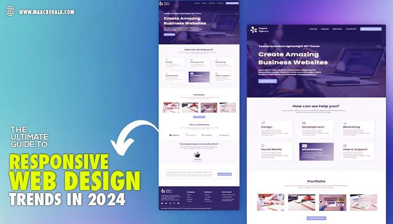
As technology continues to evolve, so does the field of web design. In 2024, responsive web design is no longer a luxury but a necessity. With the increasing variety of devices and screen sizes, ensuring that websites look and function seamlessly across all platforms is crucial. MAAC Behala, the leading web design institute, is at the forefront of nurturing the next generation of web artists who will shape the future of design. In this guide, we’ll explore the top responsive web design trends for 2024 that every web designer should know.
1. Mobile-First Design
Mobile-first design has been gaining momentum for years, and in 2024, it’s more important than ever. With the majority of users accessing websites through mobile devices, designing for mobile screens first ensures a better user experience. This approach prioritizes simplicity and efficiency, which are key elements in creating effective mobile interfaces. By starting with a mobile-first mindset, designers can scale up for larger screens without sacrificing usability.
2. Fluid Grids and Flexbox
Gone are the days of rigid, fixed-width layouts. Fluid grids and Flexbox offer greater flexibility, allowing designers to create responsive layouts that adapt to different screen sizes. Fluid grids use relative units like percentages instead of fixed units like pixels, making it easier to adjust to various screen dimensions. Flexbox simplifies the process of aligning and distributing space among items in a container, ensuring that the layout remains consistent across different devices. MAAC Dunlop offers comprehensive web design courses that cover the latest software and tools that play a crucial role in shaping the future.
3. Viewport-Based Typography
Typography plays a critical role in web design, and in 2024, responsive typography is taking center stage. Viewport-based typography adjusts the font size based on the size of the screen, providing a consistent reading experience regardless of the device. This technique ensures that text is always legible, enhancing user engagement and reducing bounce rates.
4. Customizable Viewports
With the increasing variety of devices, customizable viewports have become essential. This trend involves creating breakpoints based on the specific needs of the content rather than relying on standard device dimensions. By focusing on the content, designers can ensure that the layout adapts naturally to different screen sizes, providing a seamless user experience.
5. Dark Mode Optimization
Dark mode has become a popular feature across many applications, and it’s now making its way into web design. In 2024, optimizing websites for dark mode is a trend that enhances user experience, especially in low-light environments. This involves creating a separate stylesheet for dark mode and ensuring that all elements, such as images and icons, are optimized for both light and dark themes.
6. Micro-Interactions and Animations
Micro-interactions and animations are small but powerful tools in responsive web design. These subtle animations provide feedback to users, making interactions more intuitive and engaging. In 2024, expect to see more designers incorporating micro-interactions to guide users through the website, enhance usability, and create a more dynamic experience.
7. Performance Optimization
Performance optimization is a critical aspect of responsive web design. With users expecting fast-loading websites, optimizing performance is essential. This includes techniques such as lazy loading, image optimization, and minimizing the use of heavy scripts. By prioritizing performance, designers can ensure that websites load quickly and efficiently on all devices.
8. Accessibility and Inclusivity
Accessibility continues to be a significant trend in web design. In 2024, designers are focusing more on creating inclusive websites that are accessible to all users, including those with disabilities. This involves using semantic HTML, ensuring keyboard navigability, and providing alternative text for images. By prioritizing accessibility, designers can create more inclusive and user-friendly websites.
Conclusion:
Responsive web design is continuously evolving, and staying updated with the latest trends is crucial for creating successful websites. In 2024, mobile-first design, fluid grids, viewport-based typography, customizable viewports, dark mode optimization, micro-interactions, performance optimization, and accessibility are the key trends shaping the future of web design. MAAC Behala best web design institute in Kolkata remains committed to empowering the next generation of web designers, ensuring they are at the cutting edge of this exciting field. By embracing these trends, designers can create responsive websites that offer a seamless and engaging user experience across all devices.